Saturday, January 14, 2017

Powershell: Retrieving Qualtrics Survey Results Starter Script

Retrieving survey results from Qualtrics is less convenient than ever with the Qualtrics v3 API! 

Don't get me wrong, it's great that you can call a REST API to retrieve results from your survey. The inconvenient part is having to make three different API calls to get the results and ending up with a file that needs to be unzipped before you can work with it.

Thankfully, with PowerShell, this is a fairly straightforward task. Although there are many examples on how to do this using other programming languages, I was unable to find one using PowerShell, so I'm providing the script below as a starter script for your own purposes. You can easily add to this script if you need to export results in a different format (I only tested the below using "json" and "xml" as arguments) or wish to retrieve only a subset of responses or questions.

All of the information needed to create your API calls is nicely documented on the Qualtrics API site.


function Get-Qualtrics-Response-Export {
    param(
        [string] $organizationId,
        [string] $dataCenterId,
        [string] $apiToken,
        [string] $format,
        [string] $surveyId,
        [string] $outFile
        )

    $hostName = "{0}{1}qualtrics.com" -f "$organizationId.".TrimStart('.'), "$dataCenterId.".TrimStart('.')

    # ---------------------------------------------------------------------------- #
    #
    # XML - Create Response Export - Starts an export for a survey in XML format
    # https://api.qualtrics.com/docs/xml
    # https://api.qualtrics.com/docs/response-exports
    #
    # ---------------------------------------------------------------------------- #
    
    $url = "https://$hostName/API/v3/responseexports"
    
    $requestHeaders = @{}
    #$requestHeaders.Add("Accept", "*/*")
    $requestHeaders.Add("X-API-TOKEN", "$apiToken")
    $requestHeaders.Add("accept-encoding", "gzip, deflate")

    $requestData = @{
            format = "$format"
            surveyId = "$surveyId"
            includedQuestionIds = @()
            useLabels = $true
        }

    $body = (ConvertTo-Json $requestData)

    $response = Invoke-RestMethod -Method Post -Uri $url -ContentType "application/json" -Headers $requestHeaders -Body $body 
    $responseExportId = $response.result.id

    write-host "Response Export ID: $responseExportId"
    write-host
    
    # ---------------------------------------------------------------------------- #
    #
    # Get Response Export Progress - Retrieve the status of a response export
    # https://api.qualtrics.com/docs/get-response-export-progress
    #
    # ---------------------------------------------------------------------------- #

    $requestData = $null
    $body = (ConvertTo-Json $requestData)
    $percentComplete = 0
    $status = ""

    while($percentComplete -lt 100)
    {
        $response = Invoke-RestMethod -Method Get -Uri "$url/$responseExportId" -ContentType "application/json" -Headers $requestHeaders -Body $body 

        $status = $response.result.status

        if($status -eq "failed" -or $status -eq "cancelled")
        {
            # If you receive a status of cancelled or failed, please go back and regenerate a responseExportId 
            # for your desired export format - JSON, CSV, CSV 2013, XML, SPSS - and try this request again.
            write-host $response.result.info.reason
            write-host $response.result.info.nextStep
            break
        }

        $percentComplete = $response.result.percentComplete
        write-host "Response Export Progress: $percentComplete%"
    }

    # ---------------------------------------------------------------------------- #
    #
    # Get Response Export File - Retrieve the response export file after the export is complete
    # https://api.qualtrics.com/docs/get-response-export-file
    #
    # ---------------------------------------------------------------------------- #

    if($percentComplete -eq 100)
    {
        $response = Invoke-RestMethod -Method Get -Uri "$url/$responseExportId/file" -ContentType "application/json" -Headers $requestHeaders -Body $body -OutFile $outFile
        
        if(test-path $outFile)
        {
            $destination = split-path -path $outFile
            Expand-ZIP-File -zipFile $outFile -destination $destination
        }
    }
}

function Expand-ZIP-File($zipFile, $destination)
{
    $shell = new-object -com Shell.Application
    $zip = $Shell.NameSpace($zipFile)

    foreach($item in $zip.items())
    {
        $Shell.NameSpace($destination).CopyHere($item, 0x14)
    }
}

clear

<#
Your hostname should have one of the following formats:
    yourorganizationid.yourdatacenterid.qualtrics.com
    yourdatacenterid.qualtrics.com
    yourorganizationid.qualtrics.com
#>

$organizationId = "Your Organization ID (if exists)"
$dataCenterId = "Your Data Center ID (if exists)"
$apiToken = "Your API Token"
$format = "xml"
$surveyId = "Your Survey ID"
$outFile = "c:\ken\qualtrics\data\temp.zip"

#Get-Qualtrics-Response-Export -organizationId $organizationId -dataCenter $dataCenterId -apiToken $apiToken -format $format -surveyId $surveyId -outFile $outFile

Tuesday, April 5, 2016

DataZen Style KPIs in a Reporting Services 2012 Report

Last weekend I attended SQL Saturday in Orange County where I sat in on a number of sessions regarding how Microsoft's acquisition of DataZen is being incorporated into SQL Server 2016 Reporting Services and Power BI. I had seen the DataZen visualizations in the past and had really liked how they displayed KPIs.


DataZen KPIs

There is now an option to create these DataZen KPIs in the SQL Server 2016 Reporting Services web portal (however, not necessarily in a "paginated" report). 


SQL Server 2016 Reporting Services Web Portal

I like the KPIs because they display information in a very concise manner with the ability to show, for example, volume, a comparison to a target, whether performance is good or bad via color and some form of trend line. 

In fact, I liked them so much, I decided to try to replicate them in a Reporting Services report using SQL Server 2012. The DataZen KPI style ended up being fairly simple to reproduce by using a List with some Rectangles, Text Boxes and Sparklines. Add a couple of MDX queries with some business logic, and I was able produce the report below (note that this isn't really AdventureWorks data).


DataZen Style KPIs in a Reporting Services Report

There's nothing groundbreaking here, just an idea for implementing an effective visualization in a Reporting Services report.

Sunday, February 7, 2016

Radial Bar Chart Using D3.js - Part 3

In Part 1 of this series on re-creating the Ruder-Finn Intent Index radial bar chart using D3.js, I created the background and the category gridlines for the chart, and in Part 2, I added the question gridlines and bars. In this last part of this three part series, I add the category and question labels to the chart.

Working with the category labels was fairly straightforward, especially after reading the fantastic tutorial, Placing Texts on Arcs with D3.js. This tutorial contained the solution for putting the labels on the arc and flipping the labels on the bottom half of the chart so that they weren't upside down. I added the requirement that the whole slice (not just the end angle) had to be between 90 and 270 degrees before flipping the label. This coincidentally resulted in all of the questions labels being flipped for a flipped category label, however a better solution would have been to only flip the question label if the category label was flipped.

The question labels were more complicated to deal with because they had to additionally be wrapped and centered both horizontally and vertically.

Why People Go Online - Ruder Finn Intent Index

For wrapping the text, Mike Bostock's Wrapping Long Labels gave me a start to my solution. The function he provides ended up working well once I realized I had to determine the length of the arc and the length of the label in a less elegant manner. The result is the wrapTextOnArc function, which could use some refactoring, but gets the job done. The trick here was to create a temporary text element for use in getting an accurate measurement of the text length because using getComputedTextLength on the tspan's node just wasn't working (presumably because it was on an arc). This allowed me to determine when to wrap the text as well as assign an x value to the tspan in order to horizontally center each line.

After wrapping and horizontally centering the question label, I had to make one more pass against the question labels to vertically center them. This basically consisted of a trial and error adjustment to the dy attribute of the first line (i.e. tspan) of the label based on the number of lines.


While not resulting in an exact replica, its pretty close. I ended up making some adjustments to the code in Plunker in order to make the chart fit within my blog post. This meant shrinking the chart and shrinking the font so that the word "Community" would fit.

There's a lot of room for improvement here, including: choosing a better font; sizing a label's font if it contains a word that is too large for the allotted space (e.g.: community); flipping a question's text only if the category's label was flipped; only flipping the category label if the majority of the arc is on the bottom half; and adding more chart animation and interactivity.

However, in the end, I still feel like I accomplished my goal of establishing a jumping off point for creating a chart that will better fit my own data.
 
For a complete listing of the code and a working example, check out the Plunker: 

Saturday, January 16, 2016

Radial Bar Chart Using D3.js - Part 2

In Part 1 of this series on re-creating the Ruder-Finn Intent Index radial bar chart using D3.js, I built the chart's background and category gridlines. In this second part of the series, I'm going to focus on adding the question gridlines and data bars to the chart.

Why People Go Online - Ruder Finn Intent Index

Calculating the category start and end angles and the rotation of the gridlines was fairly straight forward since the circular chart is evenly divided by the number of categories. Doing the same for the questions, whose numbers varied within each category, required a little pre-processing by looping through the data and storing the start and end angles and rotation associated with each question.


The other little trick here is using the value of "userSpaceOnUse" versus the default of "objectBoundingBox" for the gradientsUnits attribute of the radialGradient, and setting the center coordinate (i.e.: cy and cx) attribute values to 0 and the radius (i.e.: r)  attribute value as the maximum radius of the bars. This allows the gradient to radiate from the center for each bar.

If you're paying REALLY close attention, you'll notice that the middle bar in the 6th category (moving clockwise from 12 o'clock) is shorter than the one in the screenshot. This is because the data to the right of the chart in the screenshot (which is what I based my chart on) lists "Manage Finances" as 30%, while the chart in the screenshot is showing roughly 60%.

In Part 3 of this series, I'll focus on adding the labels, which is a little tricky/hacky, because not only do the labels on the bottom half of the chart need to be flipped, but the question text needs to be wrapped and centered in the allotted space.

For a complete listing of the code and a working example, check out the Plunker: 

Saturday, December 19, 2015

Radial Bar Chart Using D3.js - Part 1

I recently received an email regarding a class on learning data visualization using D3.js. On a linked webpage that gave more information about the class, there was an image of a chart (see below) that really resonated with me. I liked how it displayed a variable number of questions in equally weighted categories, similar to the layout of some survey data that I deal with at work. I thought this would be a great basis for building my own chart with some features specific to my own data. Because the image was on a page advertising a class on D3.js, I naturally thought it was created with D3.js.

Why People Go Online - Ruder Finn Intent Index

However, when I started looking on the web for a D3 version of the above chart, I stumbled upon a blog post (and two others) that contained the exact same image. The posts were all written in July of 2009 (which explains the distribution of the answers) about the Ruder-Finn Intent Index on Why People Go Online. Links to the original chart on the www.ruderfinn.com site were no longer valid, but after a little more searching I found a different version (written in Flash) at www.intentindex.com, which enables one to experience the chart animations and interactivity.

With the knowledge that a D3 version of this chart didn't exist, I decided that a good exercise (and the basis for this series of blog posts) would be to try to replicate the look of the Ruder-Finn Intent Index. I could then use it to come up with a chart that would better fit my own data.

Searching through D3 samples online, I came across a Radial Bar Chart which I felt was a good starting point. This contained many of the elements that I would need to replicate the Ruder-Finn Intent Index chart, such as the gridlines, radiating bars and a simple, but effective, animation.


Based on that code, I was able to piece together the above background for my chart. Nothing really groundbreaking, but a decent replica of the Intent Index chart.

In Part 2 of this series, I'll add the question gridlines and bars within each category. In Part 3, I'll add the category and question labels.

For a complete listing of the code and a working example, check out the Plunker: 

Friday, April 3, 2015

AngularJS Expand/Collapse All Rows in a Hierarchical Table

I've been working with AngularJS lately as an alternative to the traditional way of displaying and editing data in SharePoint. In particular I've been using this framework with custom web services as a quick way of accessing and editing information not stored in SharePoint.

One of these external sources of data which I needed to display within my SharePoint site consists of dealership information, including the brands and product types that they are active in. So, to begin with, I created a web service that returned hierarchical JSON consisting of dealers and their brand/product combinations. A somewhat simplified example looked like the following:

[
  {
    "DealerID": 1,
    "Dealer Name": "Dealer 1",
    "Address": "123 Main St",
    "City": "Irvine",
    "State": "CA",
    "ZIP Code": 92603,
    "Brands": [
      {
        "Brand": "Brand A",
        "Product I": "",
        "Product II": "X",
        "Product III": "X",
        "Product IV": "X",
        "Product V": "X"
      },
      {
        "Brand": "Brand B",
        "Product I": "",
        "Product II": "",
        "Product III": "X",
        "Product IV": "",
        "Product V": "X"
      }
    ]
  },
  {
    "DealerID": 2,
    "Dealer Name": "Dealer 2",
    "Address": "456 2nd Av",
    "City": "Portland",
    "State": "OR",
    "ZIP Code": 97225,
    "Brands": [
      {
        "Brand": "Brand A",
        "Product I": "X",
        "Product II": "X",
        "Product III": "X",
        "Product IV": "",
        "Product V": "X"
      },
      {
        "Brand": "Brand C",
        "Product I": "",
        "Product II": "",
        "Product III": "X",
        "Product IV": "",
        "Product V": "X"
      },
      {
        "Brand": "Brand D",
        "Product I": "",
        "Product II": "",
        "Product III": "X",
        "Product IV": "X",
        "Product V": "X"
      }
    ]
  }, ...

In order to display this data I decided to use a hierarchical table layout, where one row would show the dealer information and the next row would contain a child table that would display the brand information. This was easily accomplished using Angular's ng-repeat-start for the first row and ng-repeat-end for the second, repeating this two-row pattern for all dealers.

Because ng-repeat produces a separate child scope for each dealer row, I could add a button element to a cell in the dealer row with an ng-click event that toggles an "expanded" property on the scope. The related brands table row could then be shown or hidden by setting the ng-show property equal to the scope's "expanded" property. In preparation for the expand/collapse all capability, I also added a button to the with an ng-click event that toggles an "allExpanded" property of the rootscope (which is largely impotent at this point). Something similar to the following:


<table>
    <tr>
        <th>
            <button type="button" ng-click="allExpanded = !allExpanded">
                <span ng-bind="allExpanded ? '-' : '+'"></span>
            </button>
        </th>
        <th>Dealer</th>
        <th>Address</th>
        <th>City</th>
        etc...
    </tr>
    <tr ng-repeat-start="dealer in ctrl.dealers>
        <td>
            <button ng-click="expanded = !expanded">
                <span ng-bind="expanded ? '-' : '+'"></span>
            </button>
         </td>
        <td>{{dealer.Dealer}}</td>
        <td>{{dealer.Address}}</td>
        <td>{{dealer.City}}</td>
        etc...
    </tr>
    <tr ng-repeat-end ng-show="expanded">
        <td colspan=5>
            <table>
                <tr>
                    <th>Brand</th>
                    <th>Product 1</th>
                    <th>Product 2</th>
                    etc..
                </tr>
                <tr ng-repeat="brand in dealer.Brands">
                    <td>{{brand.Brand}}</td>
                    <td>{{brand.Product1}}</td>
                    <td>{{brand.Product2}}</td>
                    etc..
                </tr>
            </table>
        </td>
    </tr>
</table>

So far, so easy with AngularJS!

Now for the part that wasn't so apparent and the reason for this post. How to create the expand/collapse all functionality. Googling mostly led to examples where the expanded state was being stored in the data model itself. In my example, this would mean adding an "expanded" attribute to each dealer object in my model which would make creating an expandAll function that could loop through all objects in the dealer model and setting the "expanded" attribute of each dealer object trivial. But I had no reason to pollute my dealer model with view state information. What I needed was a way to change the expanded property of each dealer row's scope based on the "allExpanded" property.


Enter Angular's $scope.broadcast and $scope.on


$scope.broadcast dispatches an event name down the scope hierarchy notifying the registered/subscribed listeners and takes an event name and an optional list of arguments. Using this method, I could create an expandAll function within my main controller (called by the ng-click event of the expand all button) to broadcast a change in the allExpanded property to all child scopes:


self.expandAll = function (expanded) {
    $scope.$broadcast('onExpandAll', {expanded: expanded});
};

On the receiving end, the $scope.on method listens for those broadcasted events. $scope.on takes the name of the event to listen for (e.g. "onExpandAll"), and an event listener function in the form of function(event, args). The "args" argument is used to access the arguments broadcasted in the $scope.$broadcast method. One way to accomplish this for the child scopes created by ng-repeat, is to create an "expand" directive.

.directive('expand', function () {
    function link(scope, element, attrs) {
        scope.$on('onExpandAll', function (event, args) {
            scope.expanded = args.expanded;
        });
    }
    return {
        link: link
    };
});

This directive can then be placed as an attribute on an element within the ng-repeat... I chose the expand button that is created for each dealer row. 

<tr ng-repeat-start="dealer in ctrl.dealers">
    <td>
        <button ng-click="expanded = !expanded" expand>
            <span ng-bind="expanded ? '-' : '+'"></span>
        </button>
    </td>
    ...

And viola...


For a complete listing of the code and a working example, check out the Plunker: 
http://plnkr.co/edit/qqNGSbw6oLUZbKqVQVpG?p=preview

Note, for my project (and this example), I used Angular 1.2.28 because I needed to support Internet Explorer 8.

Finally, although it wasn't required for my project, an interesting next step would be to convert this logic to work with hierarchical JSON that went deeper than a single child level, allowing each child to expand all of its children and so on.

Sunday, December 14, 2014

Mimicking PerformancePoint Filter Connection Formulas using the Query String (URL) Filter

In this post, I'm going to show you an easy trick using SharePoint's Query String (URL) Filter to create complex and dynamic dashboard filter connections for PerformancePoint Scorecards and Reports.

If you‘ve built any PerformancePoint dashboards, you’ve undoubtedly created and connected PerformancePoint Filters to scorecards and reports (Analytic Grids, Analytic Charts, Reporting Services Reports, etc.) to create powerful and interactive dashboards.

A simple (and maybe not so powerful) example, which I will build upon, would be creating a Customer Country filter using the AdventureWorks SSAS multi-dimensional database and connecting it to an Analytic Grid report summarizing data based on the Customer dimension's Customer Geography hierarchy, as in the figure below:

PerformancePoint Filter and Analytic Grid
Figure 1: A Not So Powerful Example of Using a PerformancePoint Filter
Slightly less common is utilizing a PerformancePoint Filter’s Connection Formula to filter a report in a more sophisticated manner using MDX functions (see Extend PerformancePoint dashboards by using MDX queries for a thorough explanation of Connection Formulas). For example, you could add the following simple MDX function as a Connection Formula to modify the filter connection created above:
<<UniqueName>>.Children
This formula would apply the Children MDX function to the value of the filter and when applied to the Customer Geography hierarchy, would summarize the measures by State-Province (i.e., the child level of Country).

Analytic Grid results using PerformancePoint Filter with a Connection Formula
Figure 2: A More Powerful Example Using a PerformancePoint Filter with a Connection Formula

The Query String (URL) Filter


Another filter that can be useful for PerformancePoint Dashboards is SharePoint's Query String (URL) Filter. This filter allows you to access a query string parameter and pass its value to a connected PerformancePoint Scorecard or Report. I use Query String (URL) Filters for a couple of different scenarios: one is when I want to link dashboards based on an attribute hierarchy by having a hyperlink on a dashboard (e.g., in an embedded SSRS report) which navigates to, for example, a dashboard focusing on a particular parent or child geographic area. The other scenario is when I have a parameter with hundreds or thousands of options (e.g., counties) and instead of populating a PerformancePoint Filter, I use a custom search box control to set a query string argument which is used to filter the dashboard. There are certainly drawbacks to this filter, like having to reload a page or having an attribute member value exposed in a URL, but it is also very powerful and it can open up new possibilities in your dashboard design.

Using this filter is fairly straightforward allowing you to add the filter to your dashboard and specify the query string parameter name. 

Query String (URL) Web Part Editor
Figure 3: Query String (URL) Filter Web Part Editor
By passing an attribute member value (e.g., [Geography].[Geography].[Country].&[United States]) in the “area” query string parameter, we can accomplish the same thing that the PerformancePoint Filter did without the Connection Formula. The URL would look something like the following, where "area" is the name of the query string parameter (make sure to URL encode the parameter value, otherwise it may not work):
http://servername/site/subsite/Dashboards/AdventureWorks/Page1.aspx?area=%5BCustomer%5D.%5BCustomer+Geography%5D.%5BCountry%5D.%26%5BUnited+States%5D
Using this type of filter opens up the possibility of dynamically controlling what is being summarized in a report via the URL. The problem with this approach, however, occurs when you want to create a more sophisticated filter using something similar to the PerformancePoint Filter's Connection Formula. There is no interface to enter a Connection Formula for a Query String (URL) Filter, so it can't be done. At least that's what I thought until recently when I started playing with the query string parameter value and discovered that I could apply MDX functions directly in the URL.
For example, we can use the same Children MDX function used above directly in the URL, passing [Geography].[Geography].[Country].&[United States].Children as the query string value. The URL encoded query string would look like the following:
http://servername/site/subsite/Dashboards/AdventureWorks/Page1.aspx?area=%5BCustomer%5D.%5BCustomer+Geography%5D.%5BCountry%5D.%26%5BUnited+States%5D.Children
This allows us to produce the exact same results as when we used the PerformancePoint Filter with the Children MDX function in the Connection Formula, as shown below:
Producing the Same Results Using a PerformancePoint Filter and a Query String (URL) Filter.
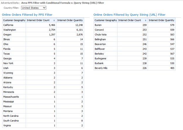
Figure 4: Producing the Same Results Using a PerformancePoint Filter (left) and a Query String (URL) Filter (right)
With this knowledge, I began to try slightly more complicated MDX formulas. For example, I could pass TopCount({Descendants([Customer].[Customer Geography].[Country].&[United States], 2)}, 10, [Measures].[Internet Order Count]) to get the top 10 U.S. cities based on Internet Order Count. The URL encoded string would look like:
http://servername/site/subsite/Dashboards/AdventureWorks/Page1.aspx?area=TopCount%28%7BDescendants%28%5BCustomer%5D.%5BCustomer+Geography%5D.%5BCountry%5D.%26%5BUnited+States%5D%2C+2%29%7D%2C+10%2C+%5BMeasures%5D.%5BInternet+Order+Count%5D%29
This would produce something similar to the following:

PerformacePoint Analytic Grid using a Query String (URL) Filter with a more complicated MDX function
Figure 5: Top 10 U.S. Cities Based on Internet Order Count (right side)

By this point
you can see that there is great potential in using a Query String (URL) Filter with MDX functions. Using this trick you can create very dynamic dashboards which can be controlled using query string parameters instead of having to hard code a conditional formula into PerformancePoint Filter. Just remember, as with anytime you are passing query string parameters in a URL, make sure that you understand how a savvy user may try to modify it to gain access to information that you did not intend.