 |
| DataZen KPIs |
 |
| SQL Server 2016 Reporting Services Web Portal |
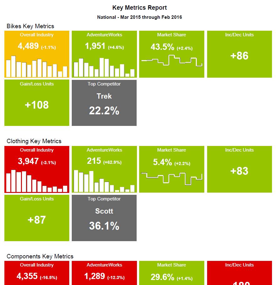
I like the KPIs because they display information in a very concise manner with the ability to show, for example, volume, a comparison to a target, whether performance is good or bad via color and some form of trend line.
In fact, I liked them so much, I decided to try to replicate them in a Reporting Services report using SQL Server 2012. The DataZen KPI style ended up being fairly simple to reproduce by using a List with some Rectangles, Text Boxes and Sparklines. Add a couple of MDX queries with some business logic, and I was able produce the report below (note that this isn't really AdventureWorks data).
 |
| DataZen Style KPIs in a Reporting Services Report |
There's nothing groundbreaking here, just an idea for implementing an effective visualization in a Reporting Services report.