Showing posts with label Visualizations. Show all posts

Tuesday, April 5, 2016

DataZen Style KPIs in a Reporting Services 2012 Report

Last weekend I attended SQL Saturday in Orange County where I sat in on a number of sessions regarding how Microsoft's acquisition of DataZen is being incorporated into SQL Server 2016 Reporting Services and Power BI. I had seen the DataZen visualizations in the past and had really liked how they displayed KPIs.


DataZen KPIs

There is now an option to create these DataZen KPIs in the SQL Server 2016 Reporting Services web portal (however, not necessarily in a "paginated" report). 


SQL Server 2016 Reporting Services Web Portal

I like the KPIs because they display information in a very concise manner with the ability to show, for example, volume, a comparison to a target, whether performance is good or bad via color and some form of trend line. 

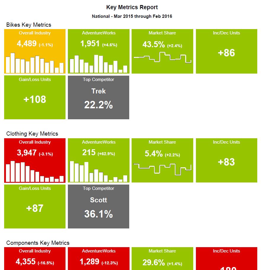
In fact, I liked them so much, I decided to try to replicate them in a Reporting Services report using SQL Server 2012. The DataZen KPI style ended up being fairly simple to reproduce by using a List with some Rectangles, Text Boxes and Sparklines. Add a couple of MDX queries with some business logic, and I was able produce the report below (note that this isn't really AdventureWorks data).


DataZen Style KPIs in a Reporting Services Report

There's nothing groundbreaking here, just an idea for implementing an effective visualization in a Reporting Services report.

Sunday, February 7, 2016

Radial Bar Chart Using D3.js - Part 3

In Part 1 of this series on re-creating the Ruder-Finn Intent Index radial bar chart using D3.js, I created the background and the category gridlines for the chart, and in Part 2, I added the question gridlines and bars. In this last part of this three part series, I add the category and question labels to the chart.

Working with the category labels was fairly straightforward, especially after reading the fantastic tutorial, Placing Texts on Arcs with D3.js. This tutorial contained the solution for putting the labels on the arc and flipping the labels on the bottom half of the chart so that they weren't upside down. I added the requirement that the whole slice (not just the end angle) had to be between 90 and 270 degrees before flipping the label. This coincidentally resulted in all of the questions labels being flipped for a flipped category label, however a better solution would have been to only flip the question label if the category label was flipped.

The question labels were more complicated to deal with because they had to additionally be wrapped and centered both horizontally and vertically.

Why People Go Online - Ruder Finn Intent Index

For wrapping the text, Mike Bostock's Wrapping Long Labels gave me a start to my solution. The function he provides ended up working well once I realized I had to determine the length of the arc and the length of the label in a less elegant manner. The result is the wrapTextOnArc function, which could use some refactoring, but gets the job done. The trick here was to create a temporary text element for use in getting an accurate measurement of the text length because using getComputedTextLength on the tspan's node just wasn't working (presumably because it was on an arc). This allowed me to determine when to wrap the text as well as assign an x value to the tspan in order to horizontally center each line.

After wrapping and horizontally centering the question label, I had to make one more pass against the question labels to vertically center them. This basically consisted of a trial and error adjustment to the dy attribute of the first line (i.e. tspan) of the label based on the number of lines.


While not resulting in an exact replica, its pretty close. I ended up making some adjustments to the code in Plunker in order to make the chart fit within my blog post. This meant shrinking the chart and shrinking the font so that the word "Community" would fit.

There's a lot of room for improvement here, including: choosing a better font; sizing a label's font if it contains a word that is too large for the allotted space (e.g.: community); flipping a question's text only if the category's label was flipped; only flipping the category label if the majority of the arc is on the bottom half; and adding more chart animation and interactivity.

However, in the end, I still feel like I accomplished my goal of establishing a jumping off point for creating a chart that will better fit my own data.
 
For a complete listing of the code and a working example, check out the Plunker: 

Saturday, January 16, 2016

Radial Bar Chart Using D3.js - Part 2

In Part 1 of this series on re-creating the Ruder-Finn Intent Index radial bar chart using D3.js, I built the chart's background and category gridlines. In this second part of the series, I'm going to focus on adding the question gridlines and data bars to the chart.

Why People Go Online - Ruder Finn Intent Index

Calculating the category start and end angles and the rotation of the gridlines was fairly straight forward since the circular chart is evenly divided by the number of categories. Doing the same for the questions, whose numbers varied within each category, required a little pre-processing by looping through the data and storing the start and end angles and rotation associated with each question.


The other little trick here is using the value of "userSpaceOnUse" versus the default of "objectBoundingBox" for the gradientsUnits attribute of the radialGradient, and setting the center coordinate (i.e.: cy and cx) attribute values to 0 and the radius (i.e.: r)  attribute value as the maximum radius of the bars. This allows the gradient to radiate from the center for each bar.

If you're paying REALLY close attention, you'll notice that the middle bar in the 6th category (moving clockwise from 12 o'clock) is shorter than the one in the screenshot. This is because the data to the right of the chart in the screenshot (which is what I based my chart on) lists "Manage Finances" as 30%, while the chart in the screenshot is showing roughly 60%.

In Part 3 of this series, I'll focus on adding the labels, which is a little tricky/hacky, because not only do the labels on the bottom half of the chart need to be flipped, but the question text needs to be wrapped and centered in the allotted space.

For a complete listing of the code and a working example, check out the Plunker: 

Saturday, December 19, 2015

Radial Bar Chart Using D3.js - Part 1

I recently received an email regarding a class on learning data visualization using D3.js. On a linked webpage that gave more information about the class, there was an image of a chart (see below) that really resonated with me. I liked how it displayed a variable number of questions in equally weighted categories, similar to the layout of some survey data that I deal with at work. I thought this would be a great basis for building my own chart with some features specific to my own data. Because the image was on a page advertising a class on D3.js, I naturally thought it was created with D3.js.

Why People Go Online - Ruder Finn Intent Index

However, when I started looking on the web for a D3 version of the above chart, I stumbled upon a blog post (and two others) that contained the exact same image. The posts were all written in July of 2009 (which explains the distribution of the answers) about the Ruder-Finn Intent Index on Why People Go Online. Links to the original chart on the www.ruderfinn.com site were no longer valid, but after a little more searching I found a different version (written in Flash) at www.intentindex.com, which enables one to experience the chart animations and interactivity.

With the knowledge that a D3 version of this chart didn't exist, I decided that a good exercise (and the basis for this series of blog posts) would be to try to replicate the look of the Ruder-Finn Intent Index. I could then use it to come up with a chart that would better fit my own data.

Searching through D3 samples online, I came across a Radial Bar Chart which I felt was a good starting point. This contained many of the elements that I would need to replicate the Ruder-Finn Intent Index chart, such as the gridlines, radiating bars and a simple, but effective, animation.


Based on that code, I was able to piece together the above background for my chart. Nothing really groundbreaking, but a decent replica of the Intent Index chart.

In Part 2 of this series, I'll add the question gridlines and bars within each category. In Part 3, I'll add the category and question labels.

For a complete listing of the code and a working example, check out the Plunker: